
Aclara > Transforming legal literature with Wolters Kluwer Legal & Regulatory
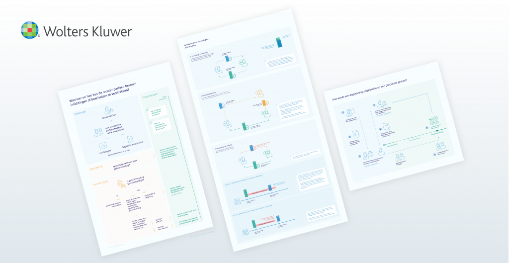
Wolters Kluwer is a major publishing house and leading in publishing legal content, e.g. books, journals, reference works, and online expert solutions. The publisher of the Groene Serie approached me for designing a set of infographics.
The ‘Groene Serie’ is one of Dutch civil law’s primary reference works with a long and rich history dating back as far as 1961. As a lawyer doing research, the Groene Serie was one of my primary sources, as it is for many lawyers. It’s like an encyclopedia that offers in-depth analysis and article-based commentaries by outstanding and prominent Dutch legal authors. An interview (in Dutch) with the publishers provides a great background, please find it here: https://www.wolterskluwer.com/nl-nl/expert-insights/de-groene-serie-al-meer-dan-55-jaar-toonaangevend
The main readership of the Groene Serie are lawyers (private practice and in-house), law students and legal professionals. They consult the Groene Serie to answer specific questions in their or an adjacent area of law. In-depth legal research means the information needs to be studied and is not always easy to comprehend or retain. The Groene Serie helps users find the information they need, put in perspective by experienced scholars and legal practitioners, and navigate the interconnectedness of topics.
The infographics are designed to further help users make a legal analysis, answer their questions and help them communicate their answers. This means the infographics aim to help lawyers get the knowledge and understanding they seek easier and quicker.
Our team consisted of a senior legal publisher and two members of the editorial board of the Groene Serie. The editorial board members are prominent law professors, judges or legal practitioners.
We decided to pick three subjects from legal content they authored: two civil procedural law topics and one in contract law:
We took our combined experience as practising lawyers, law teaching, and a judge to determine what questions are raised most concerning these topics. What confuses lawyers/law students most, what is most challenging to grasp and retain, and what questions do they receive most from their clients?
We then started making sketches for the first design, the Court’s right to order parties to share information and evidence. We believed this would be the most binary topic and therefore would lend itself well for a type of flowchart. When delving into the matter, however, we discovered – as with any legal topic, I would say – it was more complicated than expected to come up with a strict structure of interpretation of the rules.
We wanted to show readers:
Our first design version:
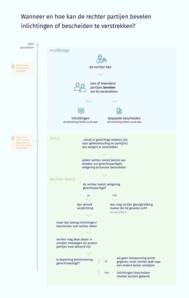
I used blue to mark the rule and green for the exceptions and procedural steps in time. Notice the orange timeline on the left? We ended up moving it to the right, so the first focus is on the main topic. And with the second design version, we combined it with the procedural steps. We also improved legibility (increasing text size and making text clearer).
After another few video calls, we changed some text, sequence of the ‘exceptions’ text blocks, to design version five. We wanted to make it as straightforward as possible for readers what discretion the Court has in assessing the situation and what the consequences would be.
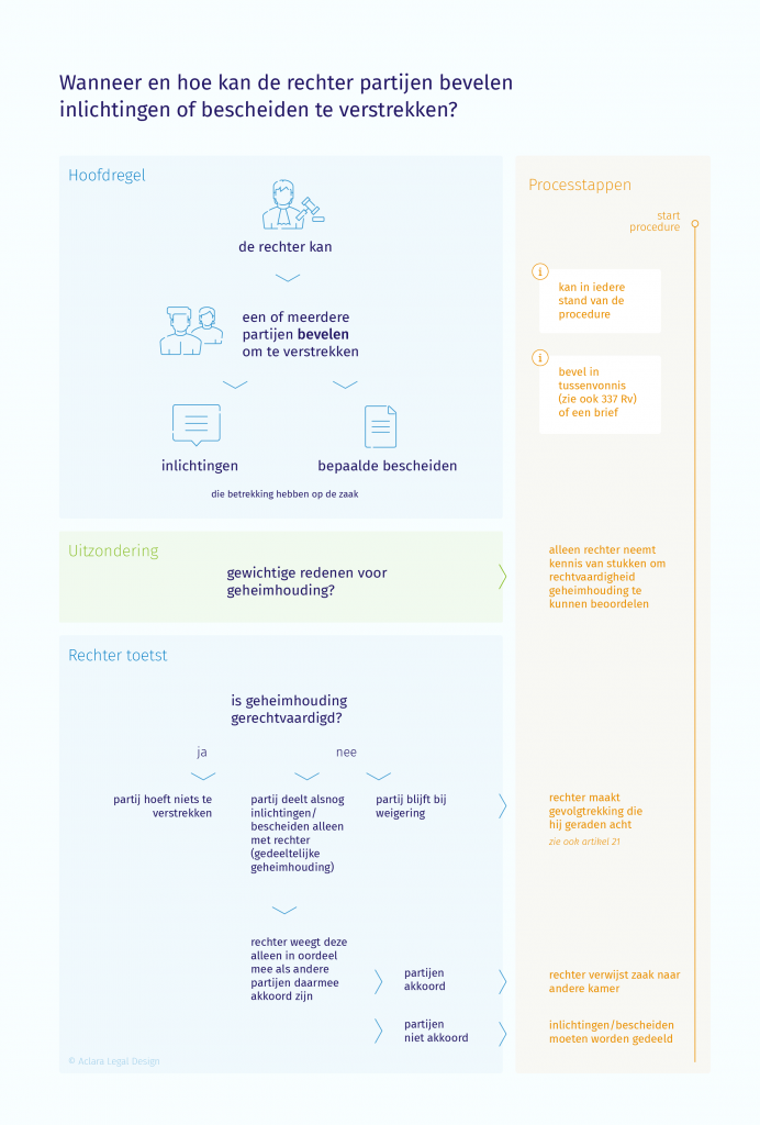
We added more icons in the sixth design version and changed the colours, making the ‘procedural steps’ less prominent (by switching from orange to green).
We tested the sixth design version with users of the Groene Serie: junior and senior lawyers, in private practice and in-house. We evaluated the test results, which resulted in minor design changes.
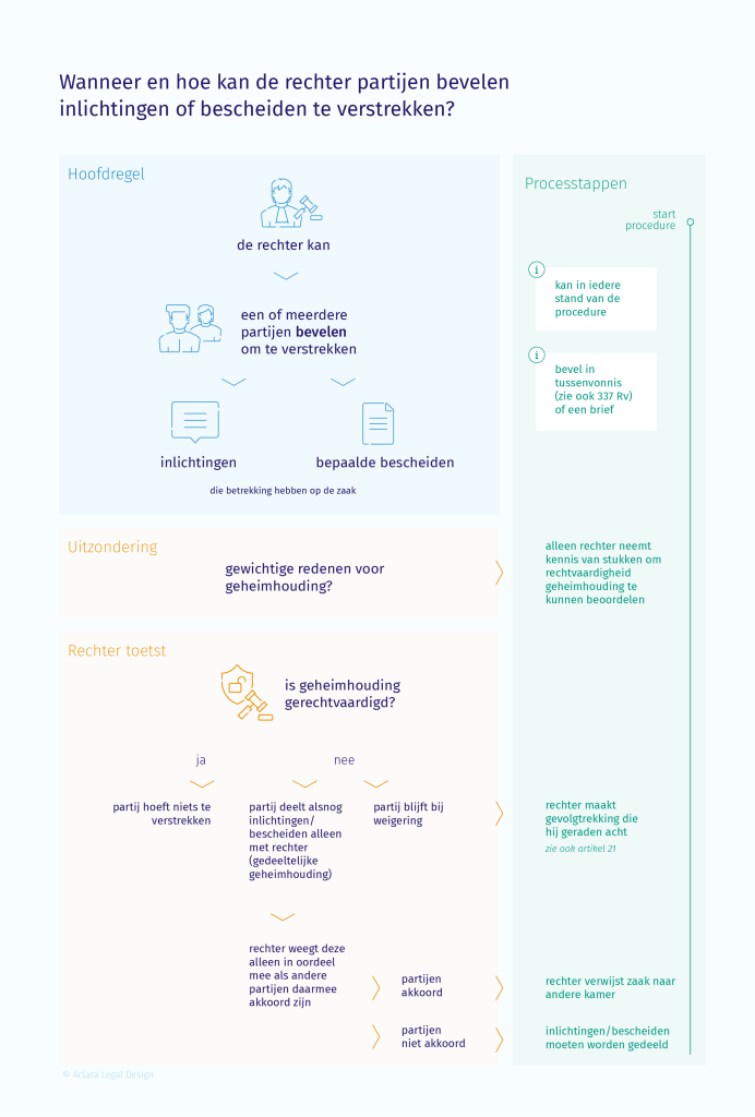
As with any project, the first steps always take more time. The second and third designs were quicker because we, as a team, grew in working together.
Issuing a writ of summons and starting civil summons proceedings is a process that confuses students, new lawyers (and clients). So we decided to show the steps involved and indicate who does what and when, keeping it concise. Our first design version:
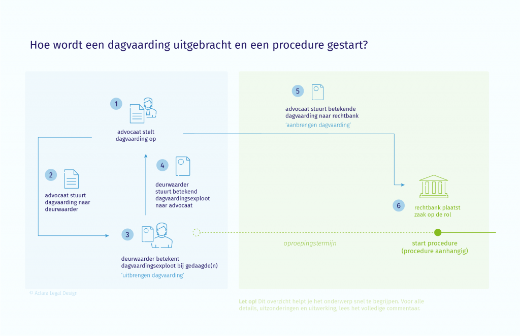
We then discussed that we needed to include all steps to make the infographic most insightful. (Note: the blue box indicates the lawyer’s steps before the proceedings are officially started, the green indicates the start of the proceedings before the Court.)
Two more design versions and testing with users resulted in this final design:
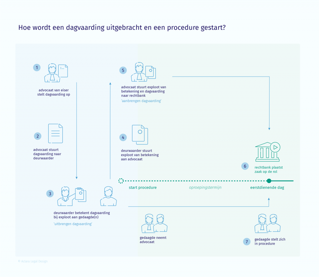
The ‘flow’ of the information is improved, and it contains all information the user needs.
Under Dutch law, there are three scenarios for the set-off of claims:
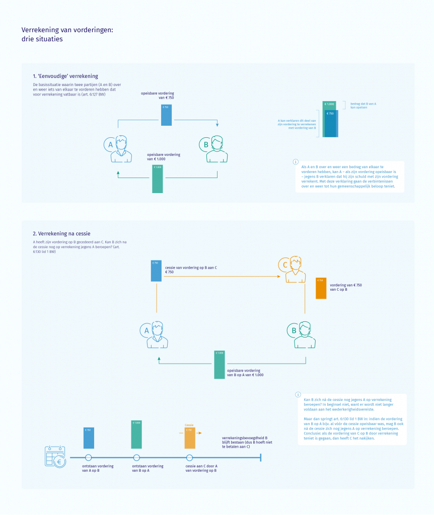
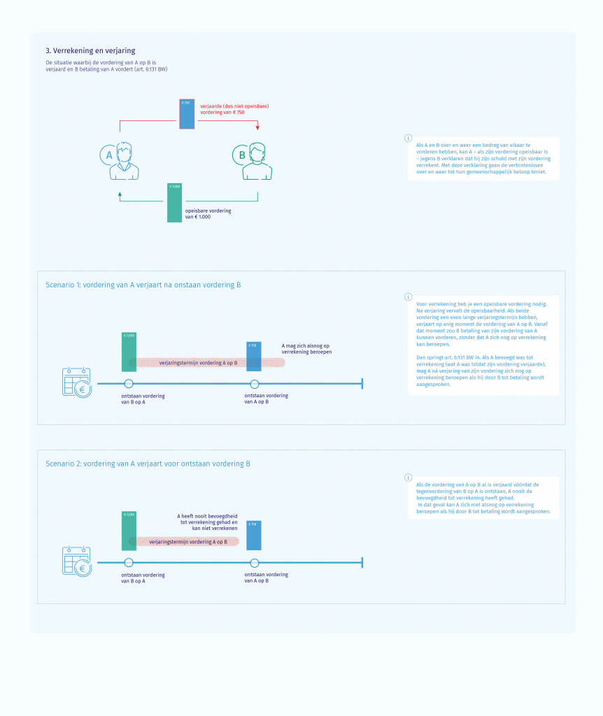
This last infographic captures the differences between three scenarios that law students and lawyers often struggle with. Where multiple parties are involved, or when the component of time is relevant (a right arises after an action), I find visualisation especially helpful in addition to text.
The first design version sets apart the three scenarios. In the second scenario, we included a timeline that we later took out because it had limited added value.
I added more icons in the second version and differentiated more with colour.
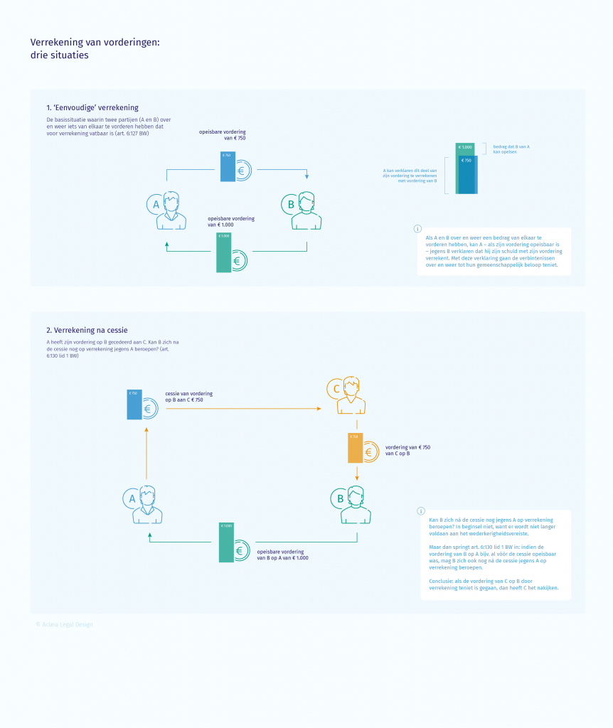
The third and final version includes the results from the test sessions. We made minor changes to the text, colour and visual elements.
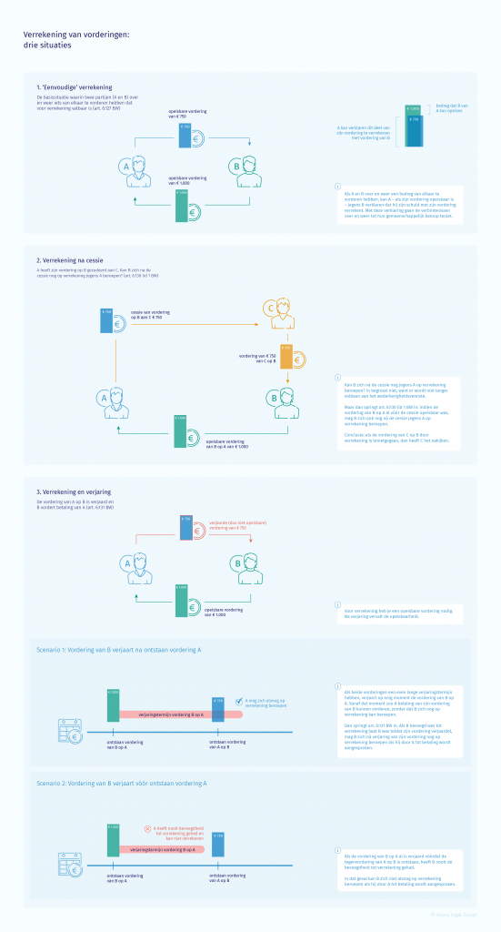
The third and final version includes the results from the test sessions. We made minor changes to the text, colour and visual elements.
We tried to make the infographic as ‘scannable’ as possible. The layout help distinguish the three scenarios, of which the third has two options.
Wolters Kluwer will publish the infographics in the online Groene Serie, in the key overview (‘Kernoverzicht’) part of the commentary describing the respective topics. That means any user looking up a set-off of claims, for example, will land on the infographic.
The infographics give readers an insight at a glance and invite them to read further, going into all details in the text. The test panels were excited to see this new format included in their trusted research materials. The infographics will save other users time and effort and make them confident studying these topics.

Anna Posthumus Meyjes is a legal designer based in Amsterdam, the Netherlands. She brings creativity, design and a user-centred approach to law. Anna worked as an attorney-at-law in an international litigation practice for ten years before founding a legal design agency, Aclara Legal Design. Aclara Legal Design provides legal design products and services that improve communication and usability of legal information and services.