
Aclara > How legal design can get your clients to love reading your contracts
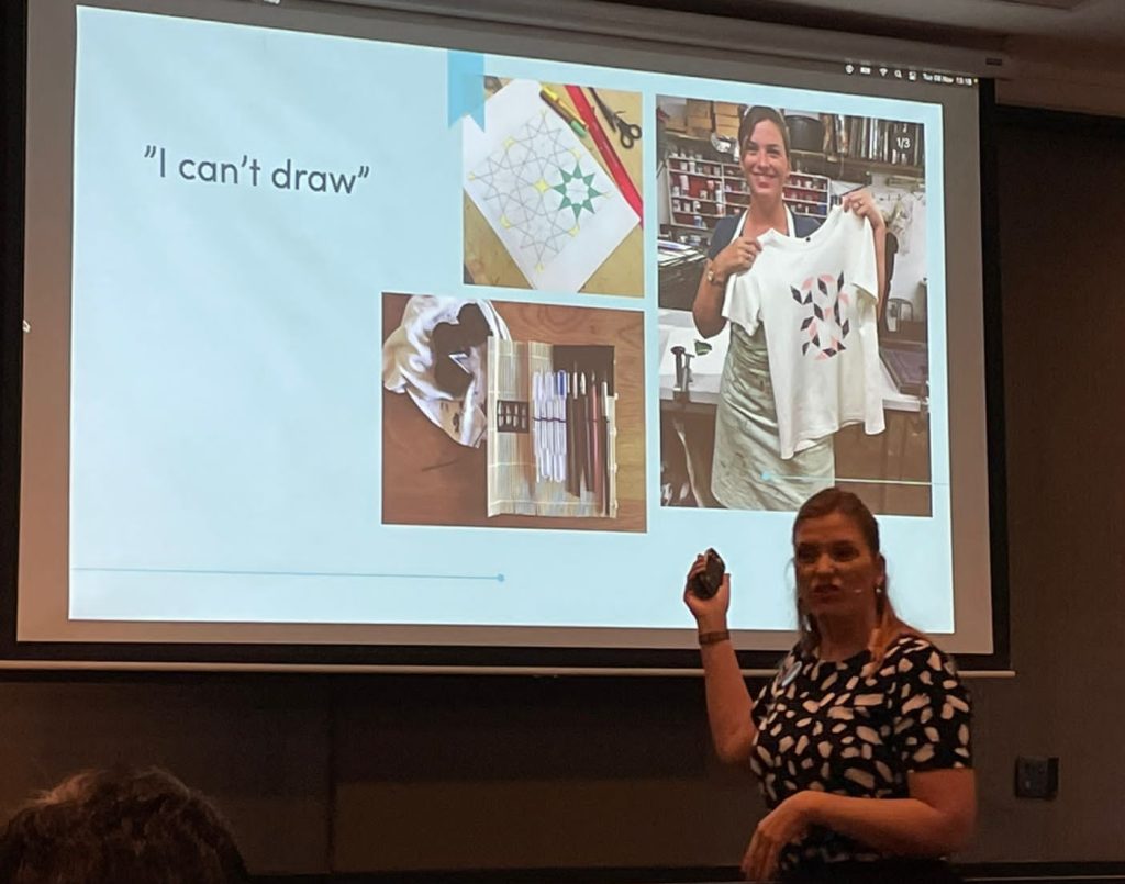
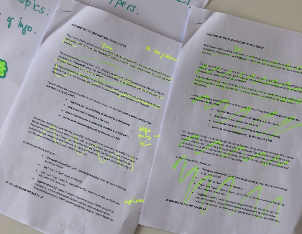
Recently, I was invited to go to Johannesburg to give a talk and host a workshop about legal design at the Legal Innovation & Tech Fest Africa 2022, which was met with rave reviews. I then linked up with fellow legal designers Elizabeth de Stadler from Rehabilitated Lawyer and Liezl Van Zyl from Hey Plain Jane in Cape Town to host a legal design jam, where we showed participants how to have fun in law (Shocking, I know!).
In this article, I will share some of the topics I discussed in my workshops and show you a quick and simple example of how you can apply legal design when working on contracts.
Lawyers spend years in law school studying all the legal theory, then spend their time in practice honing skills in legal writing, legal drafting or advocacy until that elusive state of ‘perfection’ is achieved. Creativity in law has generally been more about coming up with innovative legal arguments, or finding a loophole or gap in the legislation which can be exploited. Visual design of legal documents may traditionally be seen by lawyers as secondary, since clients are paying for legal advice, not pretty pictures.
But as the growing interest in legal design shows, good visual design and presentation of the law (backed by user research), whether it be client contracts or explaining timelines and events in court, can help clear away any confusions and make your work convincing and memorable.




For clients, their experience with legal services can be confusing and complicated. It can be argued that the legal profession was deliberately designed to be this way – clients pay the lawyers because they wade through all the complexities of case law, legislation, and legal processes for the client.
In law school, good answers for law assignments are judged on how well students understand the problem and the level of sophistication of their legal analysis. This type of mentality is brought into practice, where legal issue spotting and presenting elegant (which often means wordy and complicated) analysis are prized. Legal content (for example: legal documents like contracts or guidelines on compliance) is therefore a lawyer-to-lawyer system, where it is assumed everyone has the same basic understanding of legal knowledge.

Bringing legal content into lawyer-to-client communications is therefore often a system of the lawyer giving advice to the client in a top-down way. As a lawyer you might say to your client, “I, the lawyer, have spent a lot of time examining your problem and reading through all the cases, legislation and other relevant material. I know what you need to do.” This prescriptive approach has been the way for so long that clients may think this is the norm and that anything outside of this approach is wrong. Lawyers certainly see no reason to deviate from this approach, as it casts them in the light of omniscient experts that can save clients from their legal troubles.
However, choosing to collaborate with your clients can give you a big advantage in terms of client retention. By improving the way your complex legal content is visually presented to a client, you are not only demonstrating you understand and can solve the clients legal problems, but you care about having them understand the work you’ve done. Empowering your client in this way builds stronger bonds of trust, and this can be very helpful if you ever need to have a difficult conversation with your client (e.g., telling them they can’t do something).


Most importantly, visual content (like a contract or letter of advice) is a document which the client will refer to over and over even when you’re not there to personally go through every page with them. Clients may come to meetings with you and take their own notes, but if they do not have deep legal knowledge, these notes are surface level at best and inaccurate at worst. Making sure the legal content you provide them is clear and memorable is the best way to ensure the client has accurate information and to prevent misunderstandings.
In the clients’ eyes, the legal expertise is a given. And while many lawyers are great at verbal communication with clients, pairing this with good visual communication can give you a great boost.
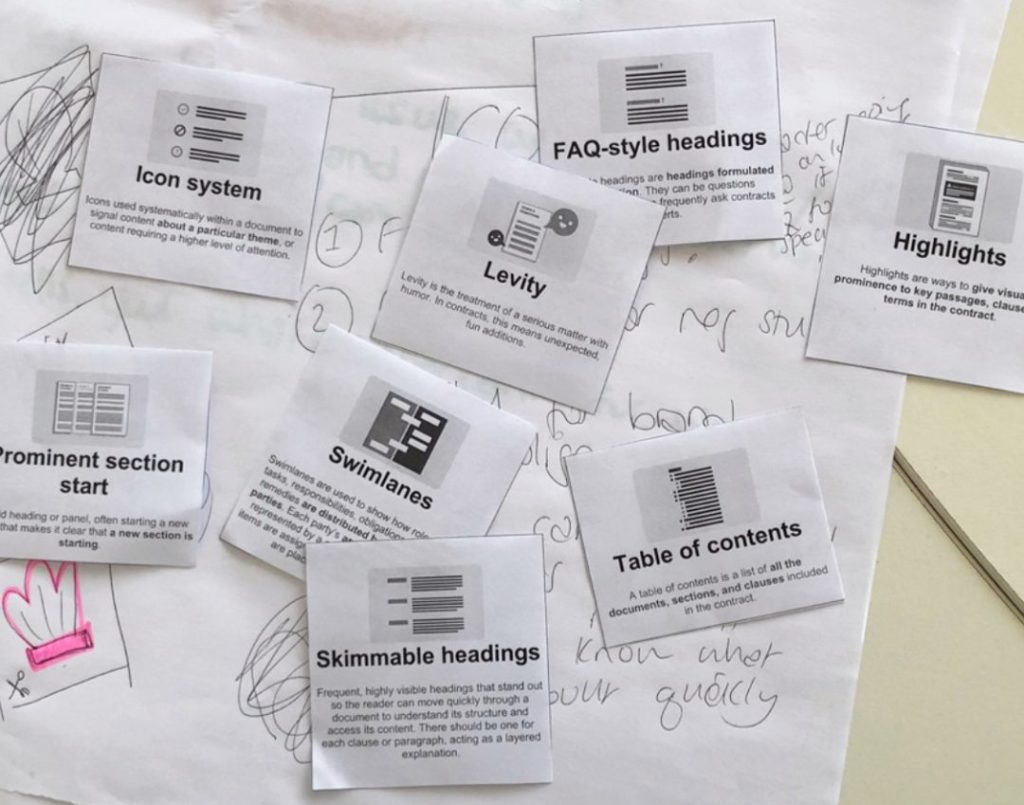
I am a big believer in the ‘try it yourself’, putting ideas to practise mentality. So here are some tips I shared in my legal design workshop at the Legal Innovation & Tech Fest Africa 2022 on how to think about the visual design of your own legal content:
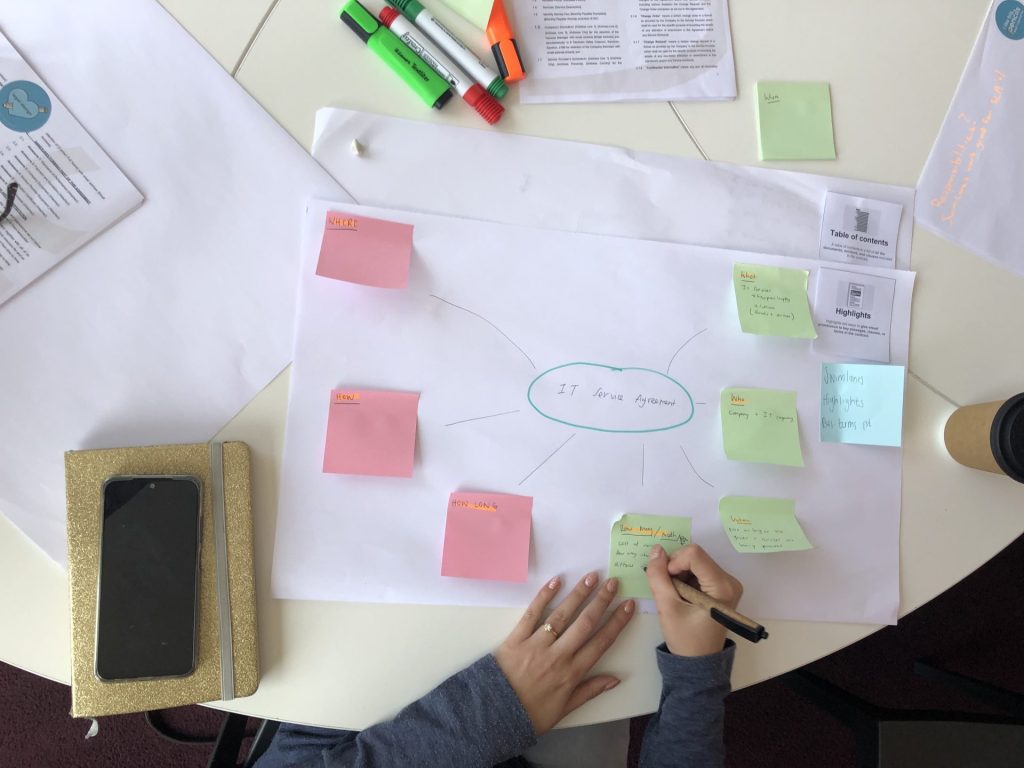
(Structuring your contract by putting user needs first): Ask your client what their contract is about, and the main topics covered will be; e.g. who, what, where, when, how long, how many, etc. Obviously, these things should be on the first page. But what this doesn’t mean is listing details about company registration numbers or definitions on the first page. As lawyers, we know this information is important to include in a contract and I am not saying it should be eliminated completely. Instead, have the first page be a clear overview of what the contract is about. See the contract design work I did with AkzoNobel for an example of what this would look like.
It will not be a surprise to any lawyer that a major complaint clients have is that the legal processes and jargon is complicated and confusing. By choosing to use clear language and get straight to the point of the clause or contract instead of trying to sound fancy or clever is an easy way to improve lawyer-to-client communication and minimise frustrations. See this example of my work with Pfizer on creating user-friendly internal guidelines on ‘dawn raids’ and antitrust compliance to get a sense of how this works.
A great way to practice Tip #2 is to think about the headings in your contract or document. So, instead of using “scope” (which has no significant meaning for non-lawyers), we might try renaming the heading to “what are we contracting?”.


Anna Posthumus Meyjes is a legal designer based in Amsterdam, the Netherlands. She brings creativity, design and a user-centred approach to law. Anna worked as an attorney-at-law in an international litigation practice for ten years before founding a legal design agency, Aclara Legal Design. Aclara Legal Design provides legal design products and services that improve communication and usability of legal information and services.